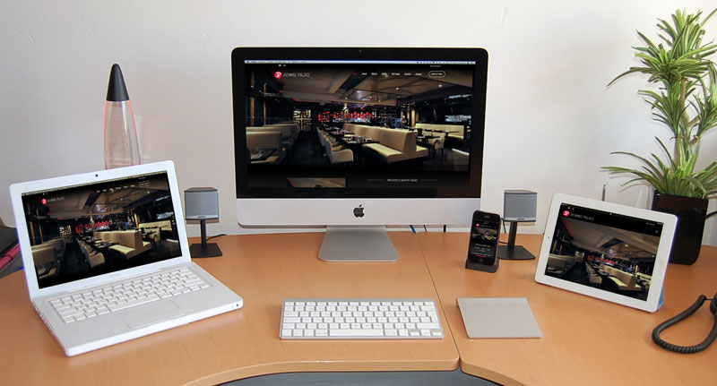
In September 2023, Bluescope was contacted by Jasmine Palace to undertake a redesign of their website, jasminepalace.ie. The redesign was to act as a refresh of design that stays on trend. It was also a great opportunity to revise some of the main backend elements of the website that could benefit from improvement.
Firstly, Bluescope worked closely with Jasmine Palace to get an in-depth scope of what features, layout, and design should be used. We had settled on clean, clear, and concise – while using the core colour scheme of their logo.
Once that was in place, it was time to revise the online menus. Previously, there were pages dedicated to each menu offered. While a WYSIWYG editor was in place, it become a bit of a chore to update individual menu items that may appear across multiple different menus. While discussing a new menu functionality, Jasmine Palace shared their ideas on what they would like to see in an online menu. Bluescope were then able to determine what was feasible and were able to implement what was requested. These features included; the ability to add images to each menu item, to be able to click on each menu item to view a pop up view of the item, this popup would then include all necessary allergen information. Previously, allergen information on the website was limited to numbers on each item that corresponded to an allergen chart at the foot of the page. Now, end users can see very quickly at a glance the allergen information of any particular dish.
In addition to the new look of menus on the front-end of the website, the backend got a major overhaul when it came to adding/removing/editing dishes. There is now a global list of all dishes on offer with imagery and allergens included. Each menu item is then placed into a specific ‘category’. Categories are named after their corresponding menu names, i.e. Á La Carte. If a menu item is to be added to multiple different menus, it can easily be added into multiple categories to display in other menus across the website. This makes it particularly easier to update pricing or information of a particular menu item in one feel swoop rather than updating multiple different menu pages.
Finally, another large upgrade to the website was seen in the gift cards section, which received the biggest revamp. Previously, there were multiple different gift card amounts to choose from with a standard design for each gift card – alternating new images from time to time. The new gift card system now allows users a multitude of options, including; choosing from a range of amounts from one screen, delay sending of a card until a set date, gift message, and the ability to choose from a range of pre-set gift card templates. Users can preview their gift card before proceeding to checkout.
As with all website designs and redesigns, we ensured that all best practice SEO methods were in place before pushing the site to live. The existing website remained functioning while we created and configured the new website in a staging environment. The website was built with mobile responsiveness in mind, therefore, users can now view their favourite foods across all menus on any device of their choosing.
Bluescope began website development at the end of September 2023 and the website was completed mid-December 2023.
If you would be interested in availing of our Website Design Services, please visit our Web Design page and fill out our online form for a quotation today.