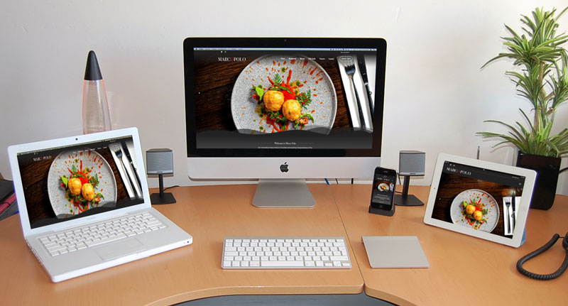
Bluescope was contacted by Marco Polo in September 2023 to redesign and refresh their website, marcopolo.ie. The new website was an opportunity to revise some of the main backend elements of the website that could benefit from a face lift.
Bluescope collaborated with Marco Polo to establish a detailed scope of the desired features, layout, and design. We decided on a clean, clear, and concise approach – while incorporating the primary colour scheme of their brand logo.
With the design framework established, attention turned to updating the online menus. The previous setup had individual pages for each menu, which made updating menu items cumbersome, especially when items appeared on multiple menus. During discussions about new menu functionalities, Marco Polo shared their vision for the online menu. Bluescope assessed the feasibility and successfully implemented the requested features. These enhancements included the ability to add images to each menu item and enabling users to click on menu items to view a popup with detailed information, including allergen details. Previously, allergen information was indicated by numbers corresponding to a chart at the bottom of the page. Now, users can quickly access allergen information for each dish at a glance.
The front-end menu design was complemented by significant improvements to the backend system for managing dishes. A comprehensive list of all dishes, complete with images and allergen information, was created. Each dish is categorised under specific menu names, such as ‘Dinner Menu’. If a dish appears on multiple menus, it can easily be added to multiple categories, facilitating seamless updates to pricing or information across different menus with a single change.
Another enhancement was made to the gift card section, which underwent the most significant transformation. Previously, users chose from a limited number of gift card amounts with a standard design, occasionally updated with new images. The new system allows users to select from a variety of amounts from a single screen, schedule the delivery of the gift card for a specific date, add a personalized message, and choose from a range of pre-set gift card templates. Users can preview their gift card before completing the purchase.
As with all our projects, we ensured that best practice SEO methods were implemented before launching the site. The existing website remained operational while the new site was developed in a staging environment. The new website was designed with mobile responsiveness in mind, ensuring that users can view their preferred dishes on any device they choose.
Bluescope began website development at the end of September 2023 and the website was completed mid-December 2023.
If you would be interested in availing of our Website Design Services, please visit our Web Design page and fill out our online form for a quotation today.